Goodreads: Kids
A revamp of the classic book inspo and tracking app, geared toward students.
UX & UI Design
May 2025
Summary:
I redesigned a popular book tracking app for elementary students to access via tablet. I conducted user interviews, a competitor audit, and created empathy maps, user personas, user journeys, user flows, and lo- and hi-fi prototypes. I researched, upgraded, and edited each version of this product that enables book tracking and suggestions.
Timeline:
May, 2025
Role:
Solo UX/UI Designer, Content Designer
Skills:
User Interviews and Research
Lo-Fi Prototyping
Hi-Fi Prototyping
Mockups
Tools:
Figma
Design Challenge:
Design a dedicated mobile app for tablet focused on social good.
My goal:
Create a mobile app that engages and excites young learners.

My Role
Lead UX/UI Designer
I lead, researched, and designed this project. I completed each step of the design process to upgrade an existing product with a new group of users in mind.
Responsibilities
I conducted user research, user interviews, and a usability study. I created user personas and user journeys. I also conducted an in-depth competitor audit.
I created storyboards, and designed wireframes, mockups, and lo- and hi-fi prototypes.
Goodreads: Kids
Goodreads: Kids

Design Solution:
Make goodreads usable for students so they can track books, share, and learn with friends and classmates.

Product Research
Goodreads is #4 in Books on the App Store. It’s helpful for recommending suggestions for books and keeping track of books users have read, but it is not very intuitive for users. With a few enhancements, this app could be even more popular among varying user groups.
User Research: User Interviews


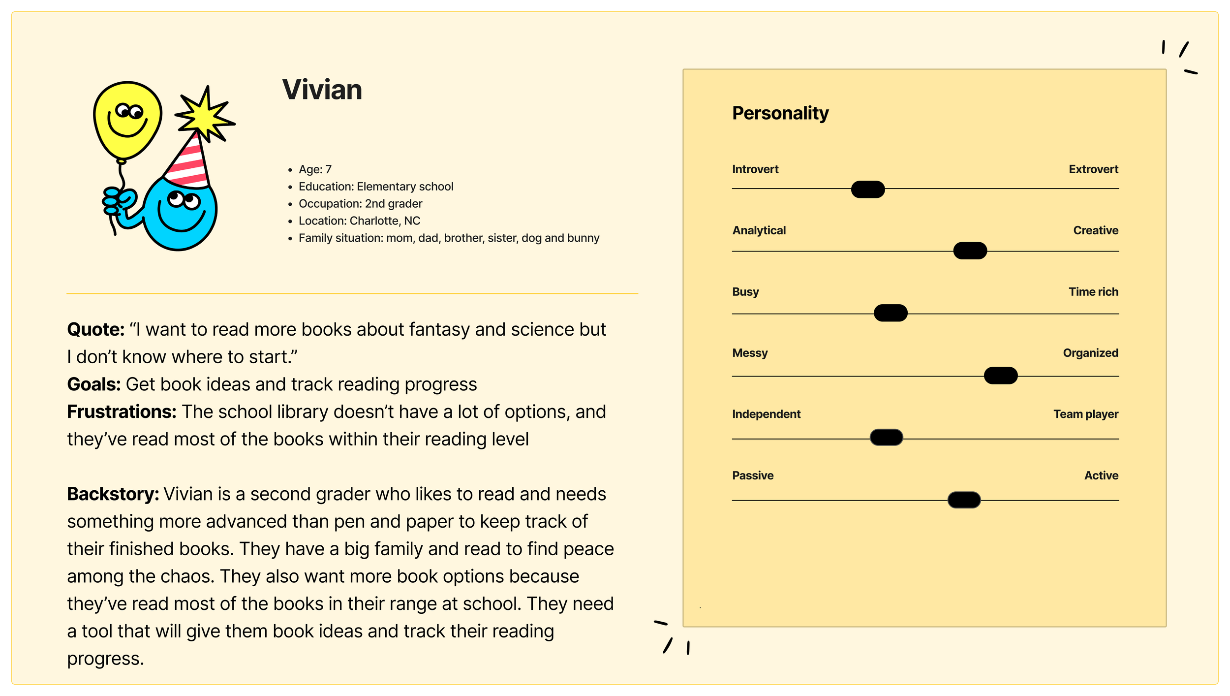
User Groups

Personas


User Stories


Problem Statements

Hypothesis Statements

Goal Statements

Competitor Audit
View Link Here
I compared the book tracking, recommendation, and navigation features of two indirect and one direct competitors to discover the extent of the need for my designs.
Opportunity Statement

User Flow Diagram

Storyboards

Close-Up

Big Picture
Paper & Digital Wireframes


Accessibility Considerations
Color Scheme
The vibrant green and yellow both have a score of “Great” for their contrast ratio. They meet WCAG Guidelines level AAA.
Proximity
I implemented the Gestalt Principle of proximity, grouping book recommendations by their origin (peer, teacher, and Goodreads: kids).
Navigation Bar
I reinvented the navigation bar with icons that clearly show what each button means. I combined some features and added others to upgrade the user experience and increase user intuition.
What I Learned
User Interviews
I learned how fun it can be to interview potential users during user research. I enjoyed getting honest feedback and even brainstorming ideas for features while assessing the need for a product within its market.
Social Good
I particularly enjoyed designing a product that will advance student education and enhance the community. It’s satisfying and exciting knowing my product will help people learn and be excited about reading.
Next Steps:
1. Share Designs
Share designs, mockups, and relevant project details with the engineering team.
2. Updates
Make design updates as needed.